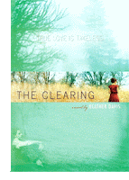
And when they think of the book they probably think of this cover:

Well that is if you read the book before a couple years ago.
I think that's when the new cover came out:

Then again I'm not really 100% sure when this new cover came out.
I personally like the old cover more. I think it's simpler and to me it seems to fit in better with Green's other cover for Looking for Alaska and his newest one Paper Towns.
So like last time I would LOVE to know what YOU think about the cover.
Your favorite one and why you like that one. :]
Lexi <3


6 comments:
I kinda like the second one better! but thats just my opinion! Where do you find all of these different covers?
Um. Well I found the Gone one on Fantastic Fiction (http://www.fantasticfiction.co.uk/) but thats actaully a UK website.
And I found the one for An Abundance of Katherines when I was bored and started googleing stuff. :]
Hope thats what you were looking for.
Lexi <3
I haven't read this book before, but I love the first cover a lot more than I do the second.
hope.
The second one is better
I like the first one, it's simpler. And also, I don't often like people on book covers.
i like the first cover because it's colorful(:
of course, i would've read it anyways, because it's called an abundance of katherines :p
either way i loveloveloved that book.
Post a Comment