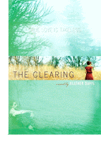
My school library had the old cover which looks like this:

But when I posted my review, I used this cover:

Now personal, I like the new one more.
I think it's more inviting.
I know you're not supposed to judge a book by it cover, but if I saw the second cover instead of the fist, I would have wanted to read it more.
But I still think that the first cover is nice and simple.
Sometimes simple works better, but I don't really think it does when it comes to this book.
Enough about my thoughts though, I wanna know which one YOU like more.
So leave a comment and let me know!
-Lexi(:


2 comments:
I like this, because to be honest I saw this book in the bookstore ages ago... and I bought it. The only thing I knew about it then was that the cover was fantastic. Perhaps that's just my preference, but when I took the cover off the inside cover was smooth like a permabound book, so it intrigued me...
Either way, I like both covers better :) Too bad I have yet to read the book...
<3 Chelsie
bookluverreviews@hotmail.com
I think I like the older one. I like the brightness of the flower.
Post a Comment